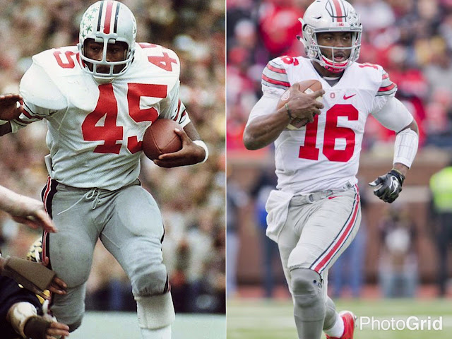
Today we're starting a series featuring excerpts from a document we sent the University of Georgia Athletic Department. The document was intended to bring attention to the lack of marketing for the UGA brand and put more focus on the history of Georgia Football.
Bringing Glory Back to Ol' Georgia: Part One
UNIFORMS
If you look at the most iconic football programs in history, there’s very little to no change in their uniforms. The uniforms are a recognizable brand just as the universities are. UGA is certainly in the top 10 of the most historic football programs in the country. There’s no need to keep this generic looking uniform any longer. This includes a return to the classic “silver britches.” I understand the new Nike pro combat, mesh stripe, style pants were intended to provide breathability but the Dallas Cowboys, Carolina Panthers and Oakland Raiders perform at the highest level of competition in actual silver pants. So can our team while remaining loyal to our traditions.
Certainly jersey and pant cuts have evolved over the years, but there's clearly no reason you can't keep your classic, iconic look. Our current rounded cartoon numbers along with the gray pants does not embody our traditions nor honor the history of Georgia Football. As you can see in the pictures above, the top programs in the country today are the same ones that have almost always been at the top. Since introducing the "Bulldog Bold" font to our football uniforms in 2013 and completely abandoning our history, we’ve compiled a record of 36-16. That’s a 69% winning percentage with exactly zero division, conference, or national championships in 4 years. I'm not saying...I'm just saying.


I agree 100%, I do not like a lot of messing around with the iconic Georgia uniforms. Saying that I did like the red pants on the road uniforms of the late seventies - early eighties.
ReplyDeleteMakes no sense why they can't tell Nike to give them SILVER BRITCHES. Those gray ones suck.......
ReplyDelete